Yenta Case Study
Research, process, prototyping, and final design
UX Design and Research, Wireframing & Prototyping, Motion Graphics, Brand Design
Figma, Photoshop, Illustrator, After Effects
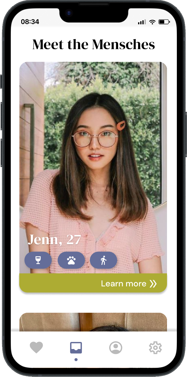
Everyone wants to find love, but not everyone is good at looking for it. Yenta is a concept for a dating app that allows users to choose a trusted friend or loved one to swipe for them and vet their matches.
I worked in a team of three to create app concept, research and test the look and feel of the prototype, and bring the final product to fruition. With my background in motion graphics, I took the lead on creating micro interactions for the app, and well as designing and animating our promotional video.
This app is featured on on by DesignRush as an example of The Best Bright Color App Designs
The Problem
It can be challenging to navigate dating apps without getting pulled into the gamified aspects of the apps that give you a dopamine boost. Many dating app users feel very frustrated and isolated by the process of modern dating apps.
Furthermore, many people in relationships would like to experience the fun of dating apps without having to actually go on dates themselves. Many also are frustrated by their single friends’ inability to find a partner, and believe they would do a better job playing matchmaker.

The Solution: Yenta
Yenta offers single people the opportunity to try a new way to date. By putting your dating prospects in the hands of a trusted friend or loved one, you are able to gain perspective in the dating process.
Simultaneously, Yenta gives people in monogamous relationships the opportunity to enjoy the fun of dating apps without having to actually date. For someone who loves to help their friends (and is perhaps a bit nosy) this is a great opportunity.

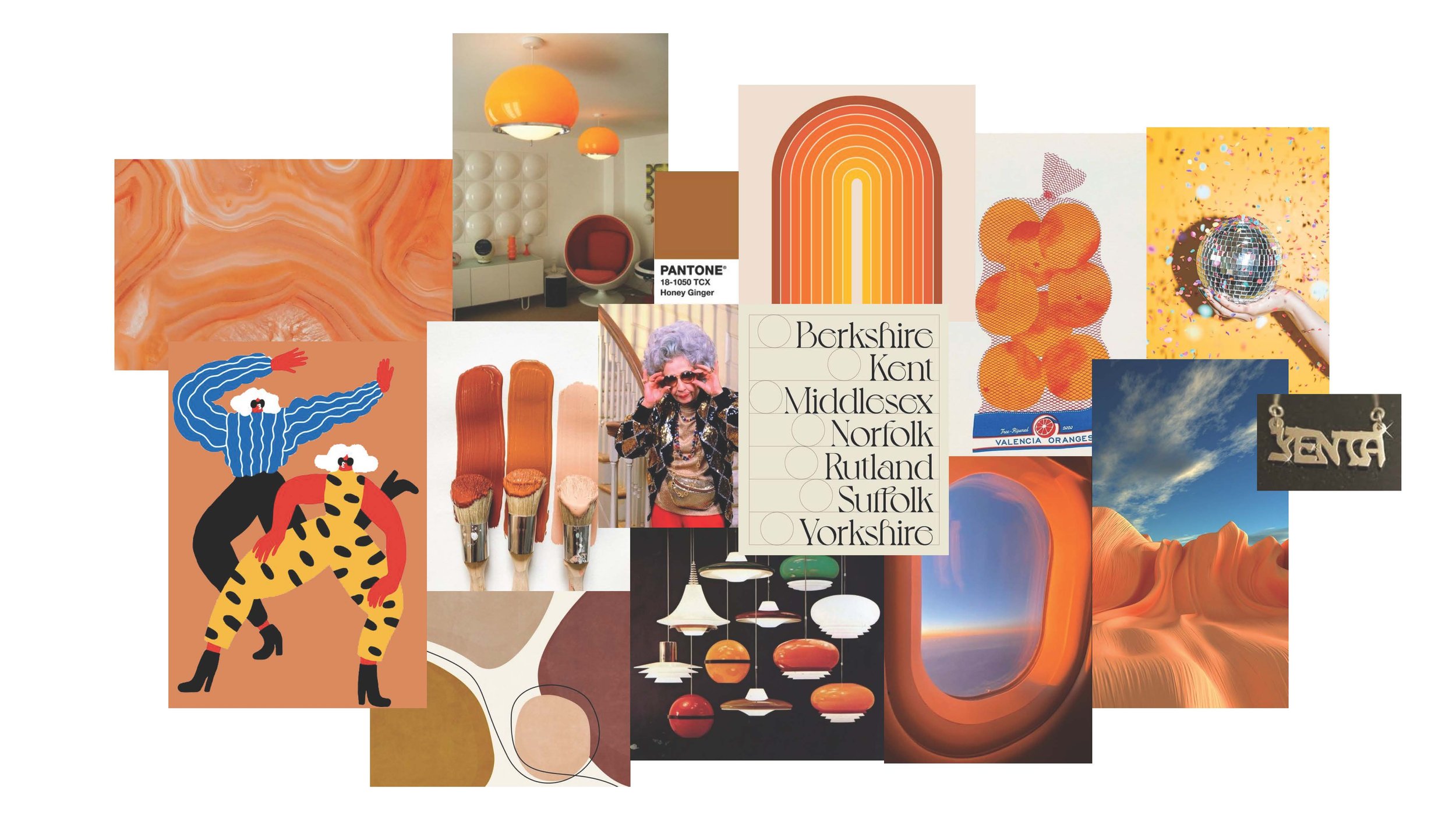
Design Exploration
We wanted to create a warm and inviting experience for our users. By having a trusting mascot, Yenta, who represents a family, friend or loved advocating for them our aim is to help our users feel supported in this vulnerable experience.

Research
Who we interviewed
While Yenta targets Millenials and Gen Z, in the original interviews we wanted to get a wide range of perspectives so that anyone could embody the roll of match maker.
Our interviews included:
Age Range: 24-74 years old and included Gen Z, Millenial, Baby Boomer participants
Professions: Wide variety including students, young professionals, and retirees
Gender: 60% of those we interviewed were women and 40% were men
Questions
What is your favorite design theme and why?
If you could change something about your favorite theme what would it be and why?
What do you intuit about how these features work?
If intuited incorrectly explain and then ask, what would help you understand how to use this feature the way I just explained it?
What would encourage you to use this app on a regular basis? (3 or more times a week)?
Insights and Changes Implemented
Insight #1
Out of all of our design directions, people resonated most with the “retro grandma” feel and enjoyed the bright, fun color pallet.
Change
Took existing color pallet and refined color selection a bit more and planned out micro interactions to bring the Yenta character to life.
Insight #2
The chat design was a little busy and could be streamlined and the text was too small.
Change
Cut down on the design elements and color to make the chat less busy and give it more breathing room and upped the chat text size for readability.
Insight #3
The floating Yenta logo was not immediately identified as the main app navigation and menu.
Change
Rethought the navigation layout and created a more obvious navigation bar at the base of app.
Insight #4
The overall layout was a bit busy and heavy and needs more breathing room.
Change
Restructured the layout of the app to incorporate more space for legibility and ease of use. Played with use of color, icons, and imagery to make the layout less busy and more visually engaging.
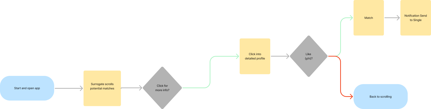
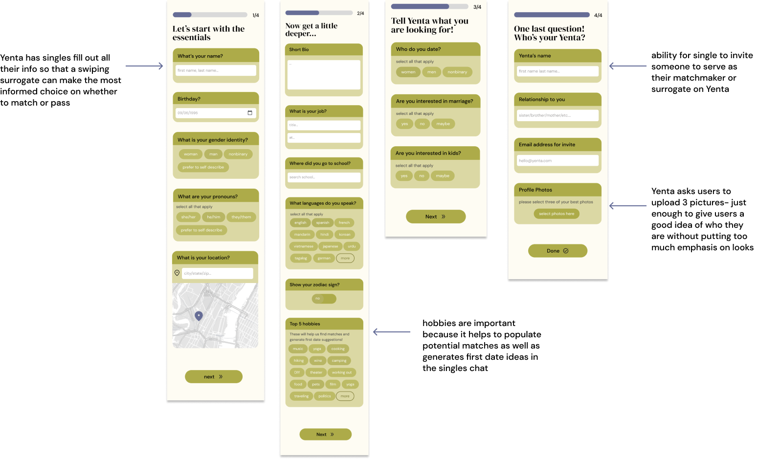
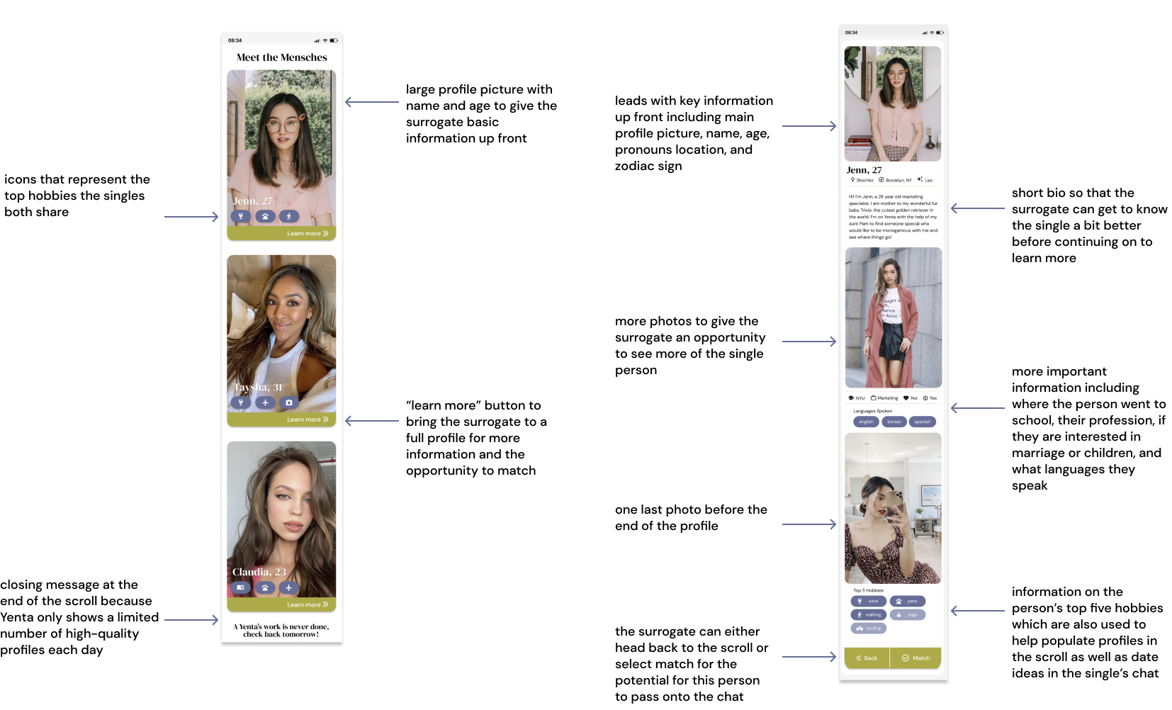
User Flows
Because Yenta has two kinds of users, “singles” who are being swiped for and just use the app to message with matches, and “surrogates” , the app required two different interfaces, and subsequently, two different user flows.